Login
|
Sign Up
menu
menu
Menu
close
home
Home
group
Apps
topic
Discussion
rate_review
Feedback
question_answer
Questions
account_circle
People
Language Packs
Mobi Apps
Documentation
arrow_back
arrow_drop_down
More
video_library
Videos
live_help
FAQ
turned_in_not
Bookmarks
history
Activity log
cancel
Feedback Creator
GeorgiosT
37 friends
.
190 photos
3
votes
People You Might Know
Posted in
Feature Suggestion
Vote
People You Might Know Why, it is not in horizontal form but only vertical, it is very ugly and occupies a lot of space
And there could be two arrows next precedent, such as Featured Businesses
More beautiful and more functional in my opinion
Status:
Rejected
Like
share
Share
0
0
0
0
0
0
0
0
0
0
Comments (
6
)
GeorgiosT
See it here at Moosocial.com takes up the whole page how bad it looks
on 02/10/19 at 12:34
Like
0
0
0
0
0
0
0
0
0
0
reply
Reply
history
Edited
Please login or register
Mike
it's a bit the same subject as here, thank you for voting
https://community.moosocial.com/topics/view/1967/free-the-block-in-layout-editor-please-version-2
on 02/10/19 at 16:50
Like
1
0
0
0
0
0
0
0
0
1
reply
Reply
history
Edited
Please login or register
ketkew
But you can set the number of "suggested people" in the column settings. On my network I have set this to 5. I think the reason why it is displayed like this is the option to the mutual friends and the option to add them directly.
on 02/11/19 at 03:15
Like
0
0
0
0
0
0
0
0
0
0
reply
Reply
history
Edited
Please login or register
GeorgiosT
ketkew
The problem is not how many people will show but vertical placement, so it holds a lot of space, and it's not nice
on 02/11/19 at 06:20
Like
0
0
0
0
0
0
0
0
0
0
reply
Reply
history
Edited
Please login or register
Mark
This is just html/css change. Should consider it as a custom work.
on 02/11/19 at 20:31
Like
0
0
0
0
0
0
0
0
0
0
reply
Reply
history
Edited
Please login or register
GeorgiosT
That is, we can change it horizontally; and if so how?
It would be much more beautiful taking up less space
on 02/11/19 at 23:05
Like
0
0
0
0
0
0
0
0
0
0
reply
Reply
history
Edited
Please login or register
Login or register to post your comment
Cookies on mooCommunity - Social Networking Script.
This site uses cookies to store your information on your computer.
Read more
east
Accept
done
Deny
remove
close
Modal title
close
Modal title
close
Share


3
votesPeople You Might Know
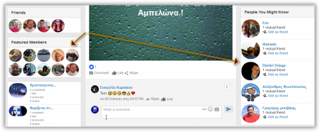
And there could be two arrows next precedent, such as Featured Businesses