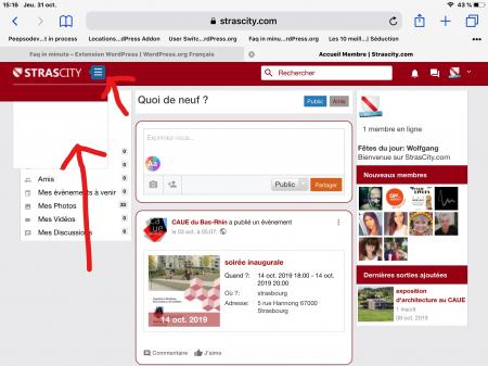
Hi,
by modifying my custom.css I was able to do what I wanted with the moosocial menu bar.
I also edit a php file to remove the login box header but it has nothing to do with my problem.
I also edit a php file to remove the login box header but it has nothing to do with my problem.
The css code in the custom css is far from clean but hey it works for now.
I have 2 problems:
1) I would like to fix the header so that it does not move when we scrol down because suddenly my links disappear
1) I would like to fix the header so that it does not move when we scrol down because suddenly my links disappear
2) on my ipad whether on safari or chrome menu links are active but we do not see them so it's a color problem specific to ipad.
something with webkit I think but I'm not sure.
On my samsung a7, whether on chrome or firefox I see the links. The menus are shifted but the links are clearly visible.
something with webkit I think but I'm not sure.
On my samsung a7, whether on chrome or firefox I see the links. The menus are shifted but the links are clearly visible.
I especially need help for the ipad, because I look everywhere I do not understand.
What works in the mobile view does not work on the ipad.
What works in the mobile view does not work on the ipad.
An idea please ?
I used this to change menu
I used this to change menu
#main_menu {
margin-top: 0px;
margin-left: -300px;
}
#mobi_menu {
text-align: center;
margin-left: 0px;
}
Result is this
margin-top: 0px;
margin-left: -300px;
}
#mobi_menu {
text-align: center;
margin-left: 0px;
}
Result is this
here is screen with ipad menu not showing, and oh, I do not understand too why the menu icon is blue when I told him red and it works everywhere except on iPad :/
Add comment comment


